E X P E R I M E N T A T I O N
PRE PRODUCTION
EXPERIMENTING WITH ART:
In the second and third week of my project, I mostly focused on experimenting with the art and animatic side of things. This means possible scenes and their layouts, colour, style, editing software and more. These experiments really helped me to visualise my project and helped me to see what goes and what doesn't.
COLOUR TESTING
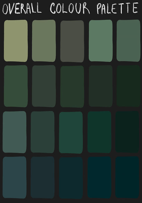
Something I knew I wanted from the beginning of my project, when forming my ideas, was for it to have a relevant and consistent colour scheme throughout, even on frames that may not be as detailed as others. I felt as if this would give the whole piece a general 'aesthetic' which from my research seemed a very important thing for my target audience - which is mostly younger people. I feel that having a consistent theme and palette will make my video much more memorable by giving it a distinct look and style as the creative projects such as animations and films that I am deeply inspired by also have qualities like these wether that is within real life film but within the colour grading or the actual colouring within illustrated or animated film.
Below is a rough idea of some colours I am going to use and also some colour experimentations with possible colours I would use for the skin of the zombie characters, I thought this would be useful as the main character in my project is a zombie. I did this by drawing a green coloured sphere, I shaded it so it would be easy to see what the colour would look like in different lighting I then tested this sphere with hues backgrounds and saturation. I took most of the overlay colours and background colours etc from my palettes.

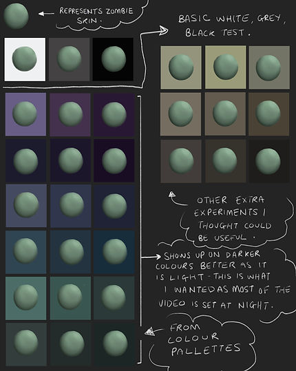
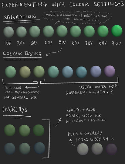
I also chose some possible frames I had previously experimented with and drawn to test different colour settings. I tested things such as different brightness levels, saturation levels and hues. I also thought that colour overlays could help me to keep a theme throughout my project. Below are many examples of how I experimented.

Here in the pictures above, I experimented with different overlays and brightness levels on a roughly drawn and coloured frame I created. In some of them I also slightly edited the hue. I mostly stuck to the blue or purple overlays from the rough colour palette ideas that I previously included above. I also tried some greenish overlays which I thought worked for many reasons however didn't feel that it allowed the colours in the drawing to be as effective as I would want them to be as it made the colours seem really flat looking. The versions of the drawing on the second row stand out to me a lot as I feel that they give a dark and melancholy atmosphere which would be a very fitting vibe for the scene I also think this way about the more saturated looking, however darker drawing on the bottom left as I think that the colours give a good indication of a dark yet beautiful forest whereas I think that the version on the bottom right for example, with the purple overlay, gives the drawing a more magical feel which wouldn't really be an acceptable theme for the scene.
I also did a similar thing below with another frame and positioned each colour palette below, I felt that the top left and bottom right were both good in some cases however also didn't make sense for the vibe and look I was wanting to achieve, the top left is way too saturated and the bottom right didn't have the right tones for what I wanted.

Here, underneath, is the Procreate tool I used to experiment with colour, I hadn't really used this too much before and it took a bit of trial and error however I did end up figuring it out pretty quickly and will definitely use it to help me in the future.

To summarise this section, as I am creating a product featuring a zombie character, I believe that the use of colour is a critical element that can greatly emphasise the overall impact and visual appeal of my work. For this reason, I have chosen to use the colours green, dark/muted purple tones, and blue hues to help convey the eerie, undead nature of the character and create a cohesive and striking visual style. This will contrast with the character's actual personality a lot and I feel that this will create irony in a good way.
The colour green, in particular, is an essential choice when depicting a zombie character, as it can effectively represent the decay and rot of the flesh, confirming the character's undead status. By using green tones in the zombie's skin for example, I can create a vivid and unsettling portrayal of the character that shows visually its status as a walking corpse.
Similarly, the use of dark/muted purple can effectively evoke supernatural or eerie elements in the animation, as well as create a moody and atmospheric effect that enhances the overall tone of the work. The use of purple hues in the shading or backgrounds can help create a sense of mystery and danger, underscoring the otherworldly kind of nature of the zombie character.
Finally, the colour blue can be used to create a sense of darkness and mystery and to highlight the cold and lifeless elements of the zombie. By using blue tones in the shadows or backgrounds of frames, for example, I can further emphasise the overall nature and mood of the story and characters. In addition to this, especially at the beginning of the animation, blue will be a commonly used tone due to there being lots of water based imagery at the beginning of the story.
In conclusion, by using the colours green, purple, and blue in my project, I believe that I can create a visually striking and effective work that effectively conveys the eerie and undead nature of the character. This is why I looked quite deeply into colour choices and such.
USING PROCREATE
Procreate is a software I have been using for around five years now and therefore I'm pretty used to the software and confident with it when it comes to illustration, it was just the animation assist part that I needed to get the hang of a little more.
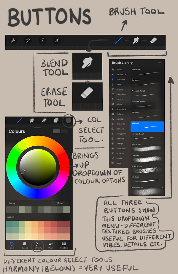
Despite this, below I have featured and reminded myself of some of the basics on Procreate - for example the tools I considered and used and the buttons (other than the ones already shown above) I will need to use to create my final product.

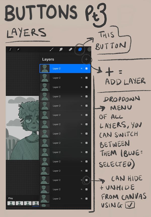
Overall I think the experiment above was really useful, as you can see in part 2 I figured something out that was really useful to me, something I wouldn't know if I hadn't done this experiment and looked around the software and at the tools and buttons more deeply.
The thing featured in the screenshot which I found out was a way to pick colours called 'Harmony' you can pick which type of colour harmony you would like- the options being complementary, split complementary, analogous, triadic, tetradic -this is really useful as it helps with staying on track with colour theory when designing backgrounds or characters.
In addition to this, going over the rules and uses when it comes to layers was useful too, layers allow you to stack the different elements of your drawing on top of each other, you can paint objects that overlap without altering the ones underneath. You can move the layers above or underneath each other by selecting and dragging them and you can also hide layers if you don't need them at points to ensure other parts of the illustration don't get in the way.
Those are the rules in terms of illustration though, when it comes to animation the rules change and each layer becomes a frame.
Below is a sheet I created to show the brushes I plan to use.

EXPERIMENTING WITH ART STYLE:
EXPRESSIONS
Something I decided to experiment with upon deciding on an art style to work with and establishing some colour palette ideas was facial expressions. Expressions are extremely important when it comes to animated characters, as within cartoons, art styles will have extremely exaggerated facial features and expressions as well as movements. I found the website https://www.ncbi.nlm.nih.gov/pmc/articles/PMC8382696/ really useful when it came to understanding the importance of facial expressions in cartoons.
Here is my experimentation below, I made use of symbols and bubbles as I have found throughout my time drawing cartoon/comic characters they are commonly used to add illustrative effect.
.png)
.png)
.png)

Overall, I really like how these experiments came out and I feel like the expressions look really good on the character design. It really confirmed to me that this is the art style I want to use and helped me to get so much more comfortable drawing in this style I have never drawn in before.
I think this will help me a lot further into my project as I can now refer back to these pages and look at how these faces should look.
EXPERIMENTING WITH ART STYLE:
BACKGROUNDS/ENVIRONMENTS


The style of the illustrations above is quite sketchy however in my opinion still very effective. I think that this could be useful for frames that I need to draw quickly or frames that are necessary however are not overly important. The only issue I had when it came to this style was that it was more difficult to work with when it came to animation so I'd probably only use them for still images in my video.
As can be seen from my tutorials featured in my research, it is always most useful to have clear line art when it comes to creating an animated illustration. This is because clear lines are easier to see when it comes to using the onion skin feature, using clear lines will help your final animation look much more clean and understandable to viewers.
This is why below, I have drawn over the top of one of the sketches with clearer lines. As can be seen, the animation looks good and it can be seen what is happening quite clearly. I feel that being able to see the sketch underneath sometimes could add character and I will most likely use this frame in the future for my product.
Underneath you can see that I have done another illustration in the same style to the one above however without the sketch layer included, this is because I wanted to show that the style looks good both with and without it. I also feel like this style could be easy to colour as well as animate, this could be a really good way to create fully coloured, good quality animations.

Below is also a couple of speedpaints where you can see my process of drawing. You can see my thoughts and ideas changing as it goes on as I figure out which things look good and which things don't as much.
EXPERIMENTING WITH ANIMATION
This is something that I focused my attention on in the second and third week. As mentioned in my research page, I don't have a whole lot of experience with animating in the Procreate software as it is not something I commonly do whilst illustration is something I do quite often so I thought that this would be really helpful for me to do.
One of the first experiments I did once learning the ins and outs of animation assist in Procreate from tutorials and such was actually putting the knowledge I had gained into practice. I went into the software and started to try different styles and techniques making animation and animatic movements.
Below are some of my experiments and attempts. I actually ended up really liking some of these and maybe plan to use them for my final piece.
As can be seen in the screenshot to the left, I am experimenting with the onion skin feature. In practice, I found this feature to be really useful and know I am definitely going to take advantage of it throughout the whole of my project.
Here, I followed the tutorials I watched and I made it so the darker lines represent the layer I am drawing on and the red lines represent the previous layer.
Below you can find some screen recorded 'speedpaint' videos of my process when drawing and animating. You can see my experimentation with things such as style, movement and more. I really liked how a lot of these turned out in the end and therefore decided to use a lot of them in my final piece - or at least improve on them and then use them later on.
Here is the full speedpaint of the part I was talking about above:
I spent a lot of time and thought making my first proper animation for my short. As usual, I began with a rough sketch to help me get my ideas down on paper, but I soon realised that the dense use of lines and dark colours made it difficult to see.
This happened with a lot of my animations and drawings when I began animating the first frames as you will probably see in others below.
In an effort to make the animation stand out more, I chose to experiment with a more colourful style but I wasn't entirely happy with the results. At that point, I understood that a clearer line art style with more visibility would be a better strategy - this also helped to keep the scene from becoming too complicated and to keep the emphasis on the animation and the movement of the hand by making the background a solid colour.
I believe I made good decisions overall as one of my goals for this whole project is to show what I have learned about animation and movement and to show my improvement from basically no knowledge to a decent amount of knowledge. Below, you can see the full final animation.
In this video to the left, you can see that at the beginning I am experimenting with style, I started by drawing in a more sketchy style and then some colour however later on decided that I wanted to be able to make the drawing move. I wanted to animate both the leaves and the water. In the sketchy style that this drawing was in originally, this would be difficult as the lines are rough and hard to follow, it would also probably be difficult for people to see due to this original sketch being on quite a dark background with dark colouring.
Therefore, I ended up changing some of these things - as can be seen, now the line art stands out better from the background and it is still dark enough to be visible that the scene is set at night time. Something you can also see that I did before editing those things is experiment with how I was going to animate the leaves. After some trial and error I found that roughly tracing the leaves could create the illusion of them blowing in the wind, same with the foam created by the waterfall to create the illusion of water flowing. I decided I'd probably use these techniques in the future for other frames as they came to be very useful for me.
Below is the final outcome on its own, it can be seen above too as I have previously discussed it in relation to other parts of my experiments.
Here is another animation I made in the same style after the experiment above worked out for me:
Here's the process I went through creating it:
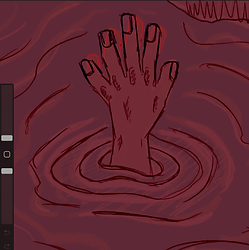
The videos below show the progress I made making the first sequence of frames for the scene where my character is drowning. As you can see, at the beginning of the speedpaint, I started with experimenting with drawing different positions and poses that would occur in the body when in this type of situation.
I knew that this animation and most others wouldn’t be the smoothest as I simply wouldn't have the time to create that much. However, one of my main goals as, I have mentioned continuously throughout my time creating so far, is to improve my hand at understanding animation and movement as a whole and understanding the software which I think so far this has been very successful. I keep reminding myself that I am learning and every animation sequence I create I am gaining more and more knowledge - so this is why I did this.
Overall, I feel that this animation could have turned out better if I'd had more time to spend on it and looking back I feel that I could have improved on the colouring however I do like the way it looks in many ways and I like the final outcome. It looks good in my edit and I plan to keep it in there as a showcase of what I have learned and the work I have put in.
Underneath, you can find a speedpaint of my process, some first attempts and my final attempt which can also be found in my final edit.
SPEEDPAINT
ATTEMPT ONE
While this attempt made a good start, I found that when adding it to my edit it didn't look good to me at all, this was because I really didn't like the way the movements looked and it was hard to use any effects in Premiere Pro that would follow the character at the right speed downwards because of the size of the page.
ATTEMPT TWO
Therefore in this final rendition, I changed how the movement looked in this section of the animatic and also changed the page size. As you can see in the second video in the 'Mid Production' section on this page, this looks more as if it fits in and the effects work well with the frames. This was not the case before therefore I feel that this experiment has proved useful.
One thing though, as can be seen in this video, the movement is extremely fast and therefore hard for anyone to process. I found when experimenting in Premiere though that this can be fixed without having to draw more frames. This is done by slowing the video down using the 'Speed/Duration' button. This can also be done in my drawing software though, Procreate, by adjusting the frames per second before exporting. It was nice however to find that I can save time by just doing a similar thing in Premiere if I forget before exporting.
Overall, I think these Procreate experiments really helped me to realise lots of new things such as how I can make things look good and how I can make better use of the software. I feel that I can better understand where I want to go with my project and I can carry these skills and build on them when it comes to future projects - which was exactly one of my goals from the beginning. While I know there is still lots I can improve on I feel that now I have the knowledge to hopefully create some good work that I am proud of!
ANIMATING EXPRESSIONS
Below is one of the first frames I experimented animating expressions with. I decided to choose Zombie 1 as I created him to be a very expressive character - his movements and the way he interacts with objects (eg. the alarm clock in the example below) are supposed to be quite exaggerated so I thought it would be quite challenging in a good way I really liked how it turned out too, It was quite challenging like I said however I really enjoyed creating it, I think that the way he is in the drawings below really show the audience how he is as a character as I think that his personality can be seen which I am really proud of overall.

CREATION PROCESS
EXPERIMENTING WITH PREMIERE PRO:
THE 'KEN BURNS' PANNING EFFECT
While my course has given me lots of knowledge on editing and Premiere Pro there are a lot of things I still don't know how to do that I would like to try in my project. I was inspired by many other animatics and projects I researched on my Research page to look into using the 'Ken Burns' panning effect - you can also see the tutorials I looked at there too.
This effect can add complexity, suspense and depth to frames that would otherwise just be stationary images. To create it you add keyframes to the start and end of the image, the longer the image is on screen (the longer the pink bar) the slower the pan effect will be.
Below is the result of my research, I practiced with a frame I previously created.
Overall, this experiment really helped me as now I feel that I know more about what I am doing when it comes to adding effects like this. I am now confident in the fact that I will be able to make my frames look and feel more interesting to viewers. Another thing this experiment taught me was it taught me a lot about keyframes in general and how to use them, before doing this I had never made a keyframe before and had no idea how they worked - now I can say that I am very confident using the software to create keyframes and panning effects.
EDITING AUDIO AND CLIPS TOGETHER
Something I also decided to do in Premiere Pro before starting my first official edit of my final project was just creating a short video with some frames I had made, edited together with some effects. I used the Ken Burns effect I had previously learned to follow my character as he was sinking and I think that it ended up going quite well. I just wanted to experiment with the software a bit as I hadn't used it in a while.
Here is my result:
MID PRODUCTION
MY FIRST ANIMATIC EXPERIMENT
This is my first try editing all of my frames together and adding both visual and audio effects on top of it. This is definitely my favourite thing I have experimented with so far and it allowed me to gain so much confidence in my ability and the project as a whole. I really enjoyed making this and I am really excited to eventually build on this and progress further. Something I like about this animatic is the way I have used effects and sound to build suspense and anticipation - for example when there is a splash, the screen is black and therefore the audience are waiting and on edge - I definitely plan to keep this quality moving forward.
I showed this animatic to multiple people and they also said a similar thing, they said that they love the anticipation and can't wait to see what happens next.
Something else I really like are the sound effects, to obtain them, I used a website called freesound.org this really helped me when it came to finding the right sound effects that felt right for my video. In my Bibliography on my Proposal page will be a list of credits stating the sounds I used and who on the site created them.
I plan to improve on it by adding and animating more frames in order to finish the story - as this is only the first part - and I also plan to hopefully improve and add more detail to some of the existing frames I have created while also building on my editing skills.
Underneath is a similar draft, however I added a kind of title frame to it and music while I also edited some of the frames from the drowning scene and also added some frames too. I didn't really know how I felt about the title part and therefore considered possibly taking it out of a future edit or editing it to look the way I want if I find more time. Something I did find from making this however is that while I may not use this exact music in the final product and may change my mind, I do quite like this style of music for it as I feel that it fits with the overall feel and visual aesthetic very well.
VOICE ACTING EXPERIMENTS
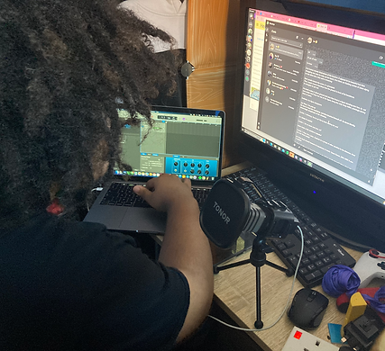
SETUP
Here is the little setup we found worked good for us!
Script.
On big screen, easy to read.
Laptop, Recording on the Garageband software on Mac as it is a software I have a little experience recording and editing sound on.
My Tonor Microphone.
Plugged into Laptop.
After I started editing some of my clips and sound together I decided to at this point, before making any more edits in Premiere, to start recording some lines as this is something I hadn't experimented at all before, not even in previous projects.
I plan to voice my main character, Jaxon, and I plan to work with a friend, Kia, to voice Zombie 1. Working with another person on this section of the project will mean that I will direct them correctly and efficiently, making sure they know exactly what I am looking for and how I want my character to sound. I knew before doing this I would also have to make sure we find times where our schedules are compatible as they have their own project to work on too!
I first started recording and experimenting with the lines of the character that speaks the most in the video all together. This character is known at this stage as just 'Zombie 1'.
Zombie 1 does the most talking throughout the episode I am creating as he is the one introducing Jaxon to his new life. The Idea behind this character is that he is funny, sarcastic and oddly likeable to the audience - despite the fact that Jaxon doesn't seem to like him much based upon the scary and overwhelming first impression.
For the character, I got a friend to voice him as I thought that they had pretty much the perfect voice for him. I felt as if they would do it well and take it seriously while adding in the correct amount of humour and charisma.
As briefly mentioned previously, I will be voicing my main character, Jaxon. While I am quite nervous for this I know that I will try my best and experiment it until I am happy with the result.
Below are some examples of the experiments I made and some notes about what we did.
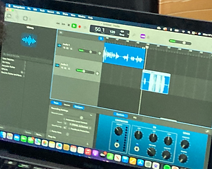
I found that using Garageband to record lines was the most efficient way I could have probably done things as I could easily get familiar with how to add effects and edit the voices to my liking. I could also fairly easily figure out the recording and the microphone settings.
Something that I did to experiment while we were recording was experimenting with the isolation mode with my microphone.
We recorded lines both in isolation mode and some without isolation mode. While all lines we recorded are useable, I found that the ones recorded in isolation mode block out more of the background noise and ambience. It prioritises the voice which is especially useful in more close up scenes and it also saves me editing out any unwanted background noise.

USING GARAGEBAND etc.
This button here to the left allows you to change the mode of the microphone to isolation mode. As can probably be picked up on at points in the raw recording, there are sections where Kia is laughing seemingly out of nowhere - in those sections we were actually having a conversation however I cannot be heard as the microphone and audio is in isolation mode and any noise in the background is pretty much erased.
As you can see below here are some effects that I added to a part of the lines in Garageband - you will be able to hear it in the raw audio below too. I added in these effects to replicate and represent the idea that the zombie is falling into a hole (you will be able to understand the context behind this if you have read my script which is located on my Idea Development page). I edited the volume, ambience and the echo using the automation tool. It was relatively simple getting the hang of it as you just manually place dots where you want the sound to change and the lines that come from them represent the levels of sound, echo or ambience. As can probably be told, if somebody is falling into a hole and screaming, the scream itself would get quieter and the ambience and echo would increase.


FINAL RESULTS
Below are the results - these are the raw recordings of what we did. We decided to record lines multiple times so that I can pick which ones I feel go best when it comes to editing and finally pulling everything together.
MORE ANIMATIC EXPERIMENT DRAFTS
In the video above is where I finally got to start adding our lines into the final production after recording, this was really useful because I got to not only see what I needed to edit or where I needed to change things such as volume or record new things and re-record things, I got to see if our voices worked together well and I got to see if they worked well with the characters.
I'd also by this point experimented a lot more with sound - for example in the scene where Zombie 1 appears as a shadow I added some sound effects to show Jaxon's fear and confusion as at this point he has just woken up from being dead - it would probably be evident that he would be a little out of sorts at the least.
Something I also did at this point of editing was a little bit of colour grading within Premiere Pro. I did this in the parts that I thought were coloured a bit too different to the rest of the product as I wanted to keep things relatively consistent; especially after seeing the results on the questionnaires and surveys I created for my Primary Research.
Below is a screenshot of what I did and how I did it. This part you can see featured in the screenshot in particular I felt as if I had animated it with colours which were too light compared to the others used throughout my video, as previously mentioned on my site I wanted to use certain colour types to give the illusion of the dark as it is set at night time. I also wanted to keep the dark kind of spooky aesthetic throughout the episode too.

As can be seen within the red dotted line, to edit I selected the 'Lumetri Colour' option and changed the settings to make the frames darker and therefore fit in with the rest of the project. You can see in the 'Animating Expressions' section above what the animation looked like before.
The edit above is most likely going to be the final unfinished one before I post my final product both on here and on YouTube for all to see! At this point I have edited all of the dialogue together and most of the drawings to go with it, so now you can see/hear the whole story put together mostly. There are only some blank spaces I am yet to fill in with illustrations. I have also by this point adjusted most of the sound to be between the correct audio levels, there is still some to edit however I am confident at this point it will be done before the deadline.