R E S E A R C H
S E C O N D A R Y R E S E A R C H
WHAT IS 2D ANIMATION ?
The art of generating movement in a two-dimensional environment is known as 2D animation.
When a series of drawings are sequenced together over time, the appearance of movement is produced. 24 frames make up a second of time on average. Depending on the type of animation, there might be as few as two or as many as 24 distinct drawings in a second of animation. Animation is often done on "2s," which means a drawing appears every two frames. This gives 2D animation its distinctive style and enables artists to save production time while also creating something of great quality.
While this method is frequently referred to as traditional animation, modern 2D production has progressed beyond hand drawing with pencil to paper to the use of digital techniques. 3D animation is now becoming more prevalent in films and tv however there are still many shows and films being created today that are still 2D animated and they are still loved by many, meaning there is still an audience out there.
Whilst 2D animation is something I have briefly done before, there is still a lot I have to learn and one of my goals during this project is to pick up some new knowledge and build on it.
HOW TO MAKE 2D ANIMATIONS IN PROCREATE
The software I will be creating my animatics and illustrations in is Procreate. I have access to this at all times due to me owning my own iPad so know that I will not have to rely on college resources all of the time and can easily work at home on my own terms as well as in class. I have been illustrating in Procreate for a while and therefore have the knowledge that I need when it comes to using the software for that reason, however I know that I will need a bit of extra help when it comes to making moving illustrations within the software as I have not yet practiced a lot with this. Below are some tutorials and resources I found that helped me quite a lot.
HOW TO USE ANIMATION ASSIST IN PROCREATE
BY 'VISUALTIMMY'
This video to the left is a tutorial on how to use the animation assist tool in Procreate. It went over the basics of using the tool itself and went over some tips and tricks as to how you can make things easier for yourself therefore teaching me a lot of new things about the software in general. Specific things I found useful included the advice on the foreground and the background.
The creator suggested that it is better to make backgrounds more opaque as it suggests to the eyes that the things in the back are further away and makes them less of the main focus and he also taught me about a setting in animation assist called 'foreground' when turning this on it makes sure that your foreground will always be at the front of every frame, saving you having to duplicate the layer for every frame you can also do this for the background. This video also showed me that you can change the settings of the onion skin option making things easier for you while you are drawing, for example, you can change the colour and the opacity of the onion skin so that you can better decipher which layer you are working on. It also spoke briefly about frames per second and said that the more frames.
This video to the right is a tutorial on how to create simple character animations in Procreate. In the video, the artist made their character do the basic movement of waving in order to explain the basics to beginners. The artist spoke about something called 'onion skin' which is a setting you can turn on and off in Procreate while using animation assist. I found this really useful. I also found it a really helpful tip to draw a sketch first and then drawing smoother and clearer line art over the top in order to make the animation look clearer and smoother, then you only have to edit certain parts of the drawing. I felt like the advice given in this video could be really good form me to use when animating simple movements or expressions.
HOW TO ANIMATE IN PROCREATE
BY 'MINTOCHIPZ'
PROCREATE ANIMATION CLASS
BY BARDOT BRUSH
This video to the left is a more of a broken down and in depth tutorial where viewers can follow along, I watched the whole thing through to see if there were any tips I could pick up, it is 1 hour long and the part where the artist starts to talk about animation starts at roughly 40 minutes in and therefore this was the most useful part for me - however there were things I learned in other parts before which I didn't already know, such as double tapping to select specific tones on the colour wheel.
I overall found this tutorial really easy to follow due to the in depth explanations and it was really useful as it confirmed and strengthened my knowledge on 2D animation and using the software in general.
WHAT IS AN ANIMATIC ?

An animatic is a series of images played in sequence, often with a soundtrack and audio. It's basically an animated storyboard. I plan for my project to appear this way and be presented like this with some more detailed animations and drawings positioned sporadically throughout to showcase my skill. Below are some examples of animatics in my research that you can look at to get a better idea of what I plan to create. I found the web page: https://boords.com/animatic/what-is-the-definition-of-an-animatic-storyboard extremely useful as it explains in detail what animatics are, what they are typically used for and what they are supposed to look like.
Below are also some examples I found of animatics by PIXAR. As can be seen there are not fully detailed or rendered however still contain important information needed to progress into something bigger. These animatics usually will not have perfectly smooth or complicated movements however will convey these movements in a way that is understandable to viewers. I feel that creating something similar to this for me is a great introduction to animation and it will help me achieve my goal which is to build on these skills.
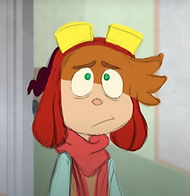
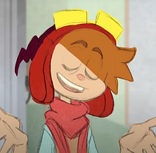
CHARACTER DESIGN THEORY
Despite designing characters being a big hobby of mine for most of my life, I surprisingly found that I had not yet really very deeply researched the official theory behind character design and rather just been inspired by growing up watching other creators draw and design and sort of took the information in visually.
Because of this I decided it would be a good idea, now that I have the opportunity, to look into this and gain some more knowledge on the subject.
Upon typing the words: 'Character Design Theory' into Google, I was immediately met with some answers, a quote from the Nashville Film Institute website:
[Reference]
[NFI. (2021). Character Design - Everything You Need to Know. [online] Available at: https://www.nfi.edu/character-design/#:~:text=Character%20design%20relies%20on%20three.]
The quote says:
"Character design relies on three key elements: silhouette, palette, and exaggeration. While a character designer must consider many things, these three are frequently at the heart of making a character design memorable or entirely unforgettable."
This made a lot of sense to me as soon as I read it, It makes sense that a good character design would need a unique and recognisable silhouette - the ability to recognise memorable characters just by their shape or outline is something incredible and usually means that the designer did a great job creating their character. A good palette of colours is important too, you don't want to have colours that clash or don't harmonise well together as your character won't draw peoples eyes - or not in the right way at least, in most cases. Something I also understand is that exaggeration is a huge part of character design, especially within cartoons where emotions and actions are majorly magnified, this is where art style comes in, different art styles and ways of drawing the shapes and the groundwork to build a character can make the right parts of it memorable and overemphasised in the best way. Something for example I do know about exaggeration and art style is that more often than not it can be seen in media and animation that eyes are an exaggerated feature on almost any cartoon character, this is because eyes are a very expressive tool that people use in real life to identify emotions and therefore exaggerating this becomes extremely effective as the audience can clearly know what their favourite characters are thinking and feeling.
I can confirm that this part of my research overall has helped me so much and I will definitely be using it to help me with designing my characters and coming up with a suitable style to draw in.
TARGET AUDIENCE & WORKLOAD
The story and therefore project is aimed at roughly 13+ year olds and the audience will be a predominantly internet audience - mostly looking towards sites such as YouTube.
The reason I chose this target audience was because I plan to take inspiration from many online animators and artists. The reason for this is because I feel that they are often current, relatable and appealing to today's youth and also, very importantly, these types of sources accurately show what the workload of one person consists of. Because I plan to upload my final product to YouTube, I think that this would be the best kind of route to go down.
If I looked at only examples of work from animation companies which typically employ over 500 people to make their films, such as Disney or PIXAR, I would be completely lost as to how much quality work one person or a few people can do in the time frame given.
To expand on the part about my target audience, I did some research about age ratings for media and films etc. and found that my piece can fall under the 'PG' category so it would definitely be suitable for my target audience.
Here is a link to support my research:
https://www.bbfc.co.uk/about-classification
This site was extremely useful to me and gave me information on every film rating.
A very important reason I wanted to aim my project at this kind of audience is because I created it to be relatable to them. My target audience is teenagers, Jaxon's experience being introduced to his new life represents a period of change, and becoming a teenager comes with a lot of change - you change a lot as a person and so does your environment. For example typically you would often move to a larger school with perhaps a lot of new rules which as many people know can be very daunting and confusing. Jaxon's feelings about his experience echo this.
Zombie 1 in a way represents the voice of authority, the things he is saying are often not fair however Jaxon feels stuck in a place where he has to go along with this. I feel as though this also represents the experience of my target audience in a way as sometimes it is easy to feel as if you don't have a voice - especially at that age.
INSPIRATION / PRACTITIONERS
Here are some examples of things I was inspired by in the initial process of creating.
(Artists, Media, Artwork etc.)
'WELCOME TO HELL'
A SHORT ANIMATED YOUTUBE FILM BY ERICA WESTER
'Welcome To Hell' is an animated short film, created in 2013 as a Senior Graduation project, that in the words of it's creator is described as:
'A character-centric comedy about an unfortunately friendly demon and the apathetic high-schooler he's supposed to be haunting.'
I was inspired by this piece in many ways as from the art style to the concept. In my opinion, and many others too, it is an amazing piece of work. The comments on the post still come in to this day even 10 years later stating things such as:
"I still watch it, this masterpiece should be a series"
"I'd like to watch this as an actual show on TV"
"I want this to be a full blown series"
The video is currently as I am typing this standing at 2,615,669 views and still gains more of an audience every day.
It's not only the numbers and statistics that amaze me to when it comes to this work though, it's the art - the character designs, the colours, the animation style and the personality it has when everything is brought together. Even though the art style is sketchy and could be classed as 'messy' by some, I feel that this adds so much character and adds to the whole thing even more in my opinion. I think that this is an extremely great thing to be inspired by when it comes to my project as it is a similar thing all together in the sense that it is a similar concept all together as it is an animated/animatic video with music, voiceover and sound effects that follows a main character trying to navigate a world they don't feel they belong in.
the fact that 10 years later people come back to the post and state how nostalgic they feel and how they remember watching.
ERICA'S ART STYLE IN 'WELCOME TO HELL' - FACES.


Here are some screenshots from Erica's film, linked above. As can be seen the art style is quite detailed and unique when it comes to the character's costume design however the facial expressions are expressive and effective yet very stylised and not too realistic (echoing my research above on good character design, it is clear that this creator has followed this theory). This could be because of the type of media this is and the groups it is aimed at and it could also be because these expressive yet relatively simply drawn facial features are much easier to change and animate and this therefore takes less time while also giving the correct vibe and feel. In addition, as can be seen the colouring is quite flat - this is because it would be almost impossible and probably take double the amount of time, maybe more to shade and render every frame of the animation correctly.
I know that I will definitely take inspiration from Erica for these things - style and colour - and also many other artists that do a similar thing, however I don't think I will end up going into as much detail on costume design due to the time frame I have to create the animation as I will have to plan my time and space things out evenly enough to be able to finish my project.
ERICA'S ART STYLE IN 'WELCOME TO HELL' - BACKGROUNDS, ANGLES, DETAIL.

Another reason I am taking inspiration from 'Welcome To Hell' is because there are a few similar settings and angles in this animation to what I imagine there to be in mine.
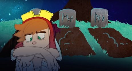
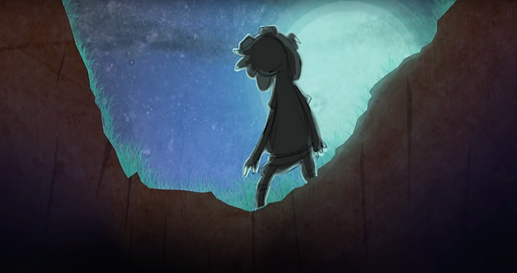
I have roughly planned that most or at least a lot of my animation is going to be set in a graveyard at night time due to it featuring zombie characters and there are many different angles, styles and colours that are included within Erica Wester's that I think I would be able to take great inspiration from.
Again, something I really appreciate from these frames especially is the work on colour. The shades used convey what time of day it is extremely well and allow viewers to see that the only light source is coming from the moon and it is quite late at night. The colouring in my opinion also fits the overall vibe and feel of the scene.
Another thing to notice too, specifically in the frame just above, the extra detail is added to emphasise the focal point only if needed. In this frame detail does not need to be added to Erica's character (Sock) because it is only his silhouette due to how dark it is outside. I think that because the artist wants the focus to be on how deep the hold/grave is and the background, they did not feel the need to add excessive detail to Sock's design. I plan to do something similar to this in my piece because i think it is an effective way to make a frame look incredibly appealing and of good quality while also saving time and keeping that effective sketchy style.
Another effective way of doing this is focusing more on some frames or parts of a frame than others. This is something commonly done in this style of animated film/video and is often still really effective. It is something that I think Wester does really well. Here are some examples below.
VERY MINIMAL AMOUNTS OF DETAIL, SKETCHY LINE DRAWING
QUITE A HIGHLY DETAILED FRAME

VERY MINIMAL AMOUNTS OF DETAIL AGAIN BUT ONLY WITH THE BACKGROUND, THE FOCAL POINTS ARE COLOURED IN.
Overall, as can be seen from these pictures and when you watch the film, the artist tends to focus more on the more important frames of the film and puts the most detail into them so that the audience focusses more on them, whereas scenes deemed as less crucial or visually important are drawn with a really small amount of detail. Another thing to mention is that the artist seems to use and draw lots of different angles or 'shots' of one scene therefore giving it depth and making it much more visually interesting and impactful.
WELCOME TO HELL 2 - TEASER TRAILER
Upon doing my research on 'Welcome To Hell' I was reminded of something incredible - Welcome To Hell 2 is coming!
This greatly helped and inspired me because It is a great example of what an animated trailer of this style and genre should be like. It also has all of the elements I was thinking about and planning on using such as voiceover, sound effects and music.
I also discovered Erica's official page for the Welcome To Hell film which holds a lot of information and was extremely useful to me in many ways.
https://welcometohellfilm.tumblr.com/
I am so glad I discovered this trailer, the official website and researched this film as it gave me so much joy and inspiration. I am so excited to develop my own animation based on the things I love the most.
'THE LAMB'
A SHORT YOUTUBE ANIMATED FILM BY HEDY CLARK
'The Lamb' is described as and to be about:
"A mismatched group of teen girls plan a grizzly murder. A macabre animated short by first-time filmmaker Hedy Clark"
It was created in 2019.
This piece by Hedy has inspired me in a sense of the simplicity of a lot of the frames. What I mean by this is that there aren't a lot of frames per movement meaning the movements of the characters are quite jumpy. This is usually the case with animatics however I like that this one still looks finished and like a finalised animation project without it being crucial that the characters have perfectly smooth and detailed movements.
I was also inspired by this video due to the fact that although it is short, it establishes a plot and an overall concept really well. It is clear to the audience what is going on and what will happen next. There are also features within the animatic that I plan on adding in such as sound effects for objects and such - for example when one of the characters squeezes a ketchup bottle - and voiceover too.
As mentioned earlier, I feel that this animatic along with other animatics on YouTube are a great thing for me to research because they show what the work of one person looks like and show the quality of which it should be.
The video stands at 211,087 views and has 1,411 Comments, most of which consist of extremely positive feedback. Hedy also had some relatively well known people involved to voice the characters such as an animator whose channel is named 'Let Me Explain Studios'. This inspired me to maybe consider asking some people close to me to help with any voiceover work if I need any extra voices.
Something Hedy did also do which inspired me was she also posted a rough animatic as there is an audience for this type of stuff, a lot of people are interested in how things are made and created and I think that after watching this I might also create a rough unfinished animatic and post it as well. This will not only allow people to see it if they are interested but it could be a way to get my voiceovers and sounds planned out and it will help me plan out the order, visualise what my final project will look like and allow me to see the progress I have made.
'THE END OF THE F***KING WORLD'
A NETFLIX SERIES CREATED BY JONATHAN ENTWISTLE
This piece of media has inspired me on many occasions, it is one of my favourite TV series due to its sarcastic charm and dry humour. It is often described as 'off beat' and 'twisted yet funny'. It has relatable and interesting characters that the viewers are drawn to, good consistency when it comes to the overall vibe and feel and a beautiful outcome. I took a lot of inspiration from this show when it came to creating my overall story behind this project. I hope to try and capture some of this humour and wit within my writing when it comes to me writing a finalised script.
I feel that this genre would really fit with my project because while it does possess a very dark vibe I think that it would make it much more likeable if it was dark yet somewhat relatable and meaningful like 'The End of The F...ing World'.
The concept in mind for my short has been outlined within my pitch and proposal however I have not yet revealed how I'm thinking the bulk of the story will be. The whole idea is that when Jaxon is finally pushed to do his part in the zombie community and bring back some food, he ends up targeting someone he thinks may be an easy target however they end up getting to know each other the more Jaxon puts off killing his target - much like James with Alyssa in TEOTFW. By the end of my story the two have a good relationship and there is the lesson learned that sometimes fitting in is far from the best thing you can do, you shouldn't have to do things you don't want to do to fit in because there are always people who will love you for who and what you are.
While at this point while I am writing this, later on in my project, I do not think I will get the time to get so far in my story in the given time limit to touch on the above and I know that my project is going to be somewhat of an introduction to this story, maybe even a 'first episode' kind of thing if I choose to go down that kind of route I still think that it is worth me keeping this in my research as it shows my thought process behind the project and shows that this is the foundation of something I may build on in the future.
This message is relatively different to TEOTFW but I feel that it gives my story light in a similar way to how the writers of this show did. I really hope to include some of this wit and charm within the dialogue for humour as I plan to make Jaxon and any other characters quite sarcastic and relatable.
This show also possesses an inner monologue kind of style and when rewatching some of the episodes and the trailer for my research I realised that I was really inspired by this as it allows the audience to hear and sometimes see the characters thoughts, making them more relatable allowing the audience to connect with them on a deeper level, I really wanted this for my project so thought that I may include some inner monologue. I feel like this may help me because often, there will probably be only Jaxon on screen and inner monologue will make his character much more interesting and likeable.
Below are some videos featuring scenes and snippets from TEOTFW that particularly inspired me.
'ART 2 ANIMATION'
INTO THE SPIDER-VERSE : SONY PICTURES
In everything that I create, I'm pretty sure it's safe to say that the animated film 'Into The Spider-Verse' film will always be a big inspiration to me, and while I obviously will not be producing something of this level in the time frame I have as one person, I can still look at their process. Before any animated film, there is usually some kind of 'base' created and that is usually in the form of animatic. What I want for my project ultimately is for it to be good enough quality that it is understandable to viewers and can still entertain them even if it is relatively simple. What particularly caught my eye with these animatics was that some important frames are more detailed than others and while it is quite basic, most of the movements are still of good quality. I plan to create a rough animatic before moving on to making my finalised one as this will help me plan and understand what I need to do better.
THE ONLINE ANIMATIC/ANIMATION COMMUNITY
This part of my secondary research as a whole is quite broad, hence the broad title, as I wanted to look at a lot of different animatic and animation creators as a whole and the things they do that typically stand out to me and will help me with my project. In this part of my research I plan to look at small creators like myself and the techniques they use etc.
I have noticed during my time online as an artist that animatics are quite popular especially when they are done over a popular song within the community at the time or within a particular artists audience. Some of these videos are extremely rough and simple featuring sketchy drawings and basic choppy movement however they still receive great online attention as some things at this point are left up to interpretation form the viewer - what I mean by this is that the song and the moving sketches paired together create great opportunity for an audience to imagine.
Animatics like these when people first started posting and uploading them became widely recognised and loved which then sparked up a whole community. Now, these videos vary from sketchy yet still effective to maybe more detailed and some even fully detailed with almost perfect movement. Each small video to me can contain a whole lot of inspiration and open me up to new ideas, even if its an artist I have just discovered when scrolling.
Below are some examples of what I mean and some brief explanations I have created about why they are inspiring to me.
SHORT ANIMATICS BY 'GHOSTCHIRYOU' ON YOUTUBE
This animatic inspired me because I feel that it was put together pretty well. It went along with a song but it told a story and had a clear beginning middle and end, whilst I will not be creating a whole story in my piece I still want it to have a good structure and some clarity. In addition to this, much like in 'Welcome To Hell' - something I previously researched - The artist of this piece focussed on certain parts. Some parts of the video are extremely detailed, some are not and have minimal detail. I noticed that these changes are sporadic throughout the piece and therefore give it some form of consistency so it does not look like an unfinished product (if the artist made all the frames at the beginning detailed and yet left the ones towards the end less detailed it would look very different and be obvious that they had ran out of time)
Another thing I noticed about this work was that despite leaving some things about their characters up to interpretation for viewers, there is a good amount of clarity on what is going on and it allows the audience space to imagine too.
I really hope that my final project can reach this kind of level as it is evident how much work this artist has put in - ESPECIALLY since in the video description it states that it was only done in a month.
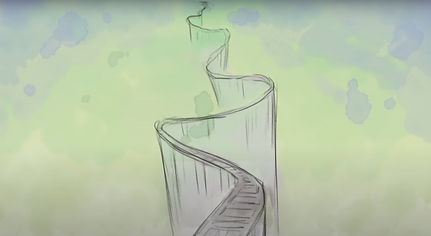
Below is another animatic by the same artist, this inspired me too in ways such as how the animatic is made with panning sort of effects over drawings. I plan to learn how use a similar technique when it comes to my work using effects I can add within the Adobe Premiere Pro editing software. There is also similar imagery within this animatic that I hope there will be in mine - the forest imagery at the start - I may take some inspiration from this too.
CREATING MOOD BOARDS
During my time as a creator, I have found that mood boards are a great way to communicate, express and get down ideas. I feel that they are a great source of inspiration, and it is always helpful to have everything there in one place to look at. With any project and especially this one I have found that Pinterest has been a great place to go when I'm lacking inspiration. I even have my own 'pinboard' (similar to a mood board) for BRAINS - I will link it below.
https://www.pinterest.co.uk/circlesandcircles/brains/
Below are all of my secondary research mood boards! I also created some from my own photography for primary research - you can find them if you scroll further down the page!
Sourced from Pinterest.com

Sourced from Pinterest.com
Sourced from Pinterest.com
CODES & CONVENTIONS
While codes and conventions is something I have researched before and already know quite a bit about, I thought it could be useful to myself to perhaps build on this and recap as I know it is something I am going to have to consider when it comes to my work - and in any media based work I do in the future too!
Below are some sites etc. that were useful to me and then a written summary of what I went over and found out.
USEFUL WEBSITES
ENGLISH TEXTUAL CONCEPTS
MEDIA CODES
In media, codes and conventions are the expected methods of communication within a particular medium. They refer to the norms, rules, and structures that are used to convey meaning and create a shared understanding between creators and audiences.
Codes can refer to the visual and audio elements within a medium, such as camera angles, lighting, sound effects, and colour palettes. Conventions, on the other hand, refer to the broader expectations and structures of a medium, such as genre conventions, narrative structures, and character archetypes.
In animation and illustration, codes and conventions are especially important because these media rely heavily on visual communication. By adhering to established codes and conventions, animators and illustrators can create work that is easily understood by audiences and effectively communicates its intended message.
For example, in animation, there are conventions around the use of certain types of movements and expressions to convey specific emotions or actions. These conventions help to create a shared understanding between animators and audiences, making it easier for viewers to follow the story and connect with the characters.
Similarly, in illustration, there are conventions around composition, colour, and visual storytelling that help to convey meaning and create an emotional impact. By using established conventions, illustrators can create work that is visually engaging and effectively communicates their message.
Overall, codes and conventions are important in media because they help to create a shared language between creators and audiences, making it easier to communicate complex ideas and emotions through visual and audio elements. By understanding and using established codes and conventions, animators and illustrators can create work that is engaging, effective, and easily understood by their intended audience.
I have spoken also on my Experimentation page in the colour testing section of the codes and conventions surrounding that using my research here, If you would like to see that feel free to click and head over there!
THE CODES & CONVENTIONS USED IN THE WORK OF MY PRACTITIONERS
As can be seen in my 'Practitioners' section, I have done a lot of explaining what it is my practitioners have created and how it will hopefully be similar to mine, however I have not yet spoken of the codes and conventions they have used which inspired me and helped me to understand where I wanted my final product to go.
I decided that after reminding myself and refreshing my knowledge on codes and conventions in general I would then apply this knowledge to my practitioners I have written about and maybe research into some other practitioners that I now find more relevant to my work now that it has progressed since writing my other research.
'WELCOME TO HELL' ERICA WESTER
As can be seen in above research, I have already spoken about Erica Wester's 'Welcome To Hell' but in less detail spoken about the codes and conventions within the animation and more the reasons that I chose them as a practitioner.
One of the main reasons I think this is a good piece of media is because it uses codes and conventions as well as many other relevant techniques really well.
One of the first examples of codes and conventions I noticed within the video was the music in the scene where the main character is in the graveyard, the creator has chosen spooky sounding music which is conventional and adds to the atmosphere of the scene and to indicate (as a code) to the audience that this is going to be a dark scene and evidently it is as the narrator then begins to talk about how the character has killed his parents and is now going to kill himself.
There is a bright sounding ukulele song that appears later on in the video after it is explained to the main character what he has to do - which is to drive Johnathan to kill himself. As can probably be told some bright sounding happy music is not really what goes with something as dark as that, the codes and conventions there don't align. Through research and looking at the work of others I have found that sometimes going against the typical conventions can sometimes work in a creators favour in an ironic sense. The happy music playing in the background as there is something dark or just unfitting of that type of music creates a funny and unique kind of irony that the scenes wouldn’t possess if it wasn't for the music being the way that it is.
A few other codes and conventions which are simple yet also good to mention are the facial expressions and the body language. Above, I mentioned two examples where going with typical codes and conventions is extremely useful and effective however I also mentioned in the other example how it can also be useful and just as effective to go against these norms to give the audience a different message. The facial and body expressions of the characters here do both of these things at different points, an example of where the facial and body expressions (codes) match with how a character would conventionally be feeling could be in the character Johnathan. Throughout almost the whole video Johnathan expresses annoyance and upset and negative emotions towards Sock, the main character, and his facial expressions and body language match this. It is conventional that somebody would feel the way Johnathan would in his situation and have those expressions. In contrast though, Sock's emotions displayed through his face and body are sometimes kind of unusual considering his situations, for example when he has killed his parents in his sleep and when he is about to kill himself, despite a brief moment of what could be considered sadness or just thought, he seems relatively unbothered by his circumstances displaying a neutral or happy looking manner - shown when he is looking at his reflection in the knife and just after when he shrugs and then stabs himself - this adds to the character as it makes him feel kind of quirky and interesting, like you want to find out more about him and watch on to see if he develops in any way emotionally. Breaking the convention of how a character would usually feel can intrigue the audience in many ways.
When looking more into facial expressions in a style like this I found that Erica Wester has actually made some in depth tutorials on things like this which proved to be very useful to me in the future.
'BUTTER LOVER' KINGA
I haven't yet spoken about this animation earlier in my research however thought it could be a good thing to talk about now.
I chose this video in the first place as I thought it had a good art style which inspired me and caught my eye and the characters ended up being funny and interesting and having unique designs, all good qualities I want my final outcome to have too.
Some things I think that this piece does extremely well when it comes to codes and conventions is the character's facial expressions, their body language, the sound effects they used, the illustration, the voice acting (speech) and the music.
When it comes to the characters mannerisms I feel that the right codes and conventions are there to be able to make this a good quality piece of work. What I mean by this is both characters have unique personalities to one another which is shown by the difference in things such as speech, body language and facial expressions. The character with the red and blue hair is presented as quite an eccentric and energy-filled character and I know this because of the codes and conventions the creator has used. This character has extremely exaggerated body language and moves around a lot when he conventionally wouldn't need to. His movements are also much faster than the other character who works at the gas station (purple hair) who seems much more laid back and perhaps tired due to the fact he is working - his movements are slower and much less exaggerated, both of these character descriptions being very conventional and showing the codes for the emotions I have suggested. This goes the same for both characters speech. The character with the red and blue hair speaks much faster, higher and with more energy than the character with purple hair who has a slow, deep more chilled out voice. Overall, I feel that the creator of this video did a really good job with presenting emotions and personality through their characters using codes and conventions.
When it comes to the sound effects and music, I feel that the illustrations on screen combined with those make it extremely clear what is going on to the audience due to the codes and conventions. There are points where I feel that music is used to demonstrate the passage of time as the music used has the properties and conventions that would suggest this. The reason I say this is because I felt as if the music playing when the character is waiting while he is working at the gas station reminded me of elevator type music or the type of music that is used while you are on hold on a telephone call. I think that it creates and allows the audience to feel what the character is feeling, maybe the boredom or the impatience because nothing interesting is happening and we are literally doing nothing except waiting. Another reason I think this is because the music stops once the other character walks in again and something different/interesting is beginning to happen.
Another thing that I found was conventional about this piece and have noticed it in many others (an example could be my earlier mentioned practitioner, Hedy Clark's animatic, The Lamb) was the way that the first few frames will establish the setting. This is conventional in most film too I think as it gives the audience a code, a wide shot or just a view of the place, establishing a setting so the way illustrations are put together is extremely important too, I plan to do something similar to this in my final product.
AUDIO
Something I thought would be a good idea to do when it comes to research was looking more into audio as I know that audio, when it comes to doing a thing like this, is done almost entirely post production and can make or break how the whole project feels and if the audience will be interested or not. I knew audio would be a challenge for me compared to the illustrations as it is something I have much less experience in.
To look into this I looked at websites, went over some of my old research to remind myself and also analysed the work of my practitioners - something I did that helped me a lot was I listened to the audio of the videos they had created with my eyes closed or without looking at the visual, illustrated elements. The audio alone could tell most of the story and I am able to listen and imagine easily what is going on.
In addition to this, a site that I found useful was:
https://mowe.studio/animation-sound-design-effects-music-motion-graphics/
It let me know that some very important elements of audio in animation/animatics are things such as ambience, music, dialogue/voice acting, sound effects/foley sounds.
When it comes to music, a movie can have a much higher level of emotion and meaning by adding a soundtrack. It's crucial that a TV show or movie's soundtrack complements the theme or mood of what it's about or what it means. This gives things so much more character, makes them so much more distinctive from other things in the media, and many films and television shows even have their own soundtracks with songs created especially for it by artists or creators, this is definitely something I would have considered if I had a longer length of time as I do have some experience with music making software and I also play guitar and ukulele.
When it comes to audio in a movie, dialogue is crucial because it moves the plot of a story forward. Without dialogue, it would be incredibly difficult to understand what was happening between characters or people. In order to make things more interesting, dialogue can also be used to express emotion, increase tension, or create suspense between characters.
Even though dialogue is typically used between two or more characters, many shows and movies also use internal dialogue, where there is a Voiceover of the character's thoughts. Another unique way some creators use dialogue is to break the 'fourth wall', this is where the character(s) will talk to the audience, usually facing the camera/forward facing to create the illusion that they are looking at you, this can add a lot to a piece of media including comedic effect and similarly to the internal dialogue, more character-audience relatability. This works well because it helps the audience relate to the character(s) more personally and develops their relationship with them.
As mentioned previously I plan to record lines for each of the characters however I also think I may include something like either internal dialogue or fourth wall breaking too to create more relatability.
Sound effects are a crucial component of movies because many sounds can't be replicated in real life while being filmed, so they're added in after the fact and always give a movie more impact. They are frequently used in action films because it can be risky to recreate effects like gunshots and explosions.
They are also utilised in all animated films because there is frequently no filming involved, only drawing, 3D modelling, and animation. An animated movie without sound effects would probably be pretty boring to watch!
Something I was also reminded about audio is that audio record levels should probably peak between -12 and -6dB. Part of the display in Premiere Pro includes a feature which measures the audio volume and it will turn red if something is too loud so you can then go to alter it.
Overall, I think that the key to successful audio in animation is to create a sound that enhances and supports the visuals, while also standing on its own as an engaging and immersive experience for the viewer.
EDITING : PREMIERE PRO
There are a lot of things I have learned during this course in the Adobe Premiere Pro software and I am now relatively comfortable with navigating and using the software however there are still some editing techniques I thought that I would like to learn about to help me with my animatic in order to give it more depth.
I noticed that in the animatics/animations I have spoken about above - one example could be the first frame after the title in 'The Lamb' by Hedy Clark - that there is an effect commonly used to pan across a stationary drawing. I did some research on this and found that this is something called the 'Ken Burns' effect.
Wikipedia states:
"The Ken Burns effect is a type of panning and zooming effect used in film and video production from still imagery. The name derives from extensive use of the technique by American documentarian Ken Burns. This technique had also been used to produce animatics, simple animated mockups used to pre visualize motion pictures."
Below are the tutorials I used to help me gain a better understanding of this effect. There is also a summary of what I learned while doing it and what I hope to get from it. More can be found on my Experimentation page about putting this knowledge in to practice.
THE 'KEN BURNS' EFFECT'
P R I M A R Y R E S E A R C H
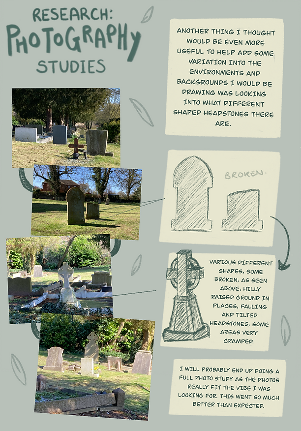
PHOTOGRAPHY
SKETCHING FROM MY OWN PHOTOGRAPHY
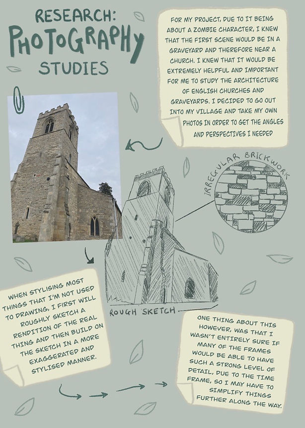
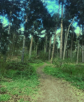
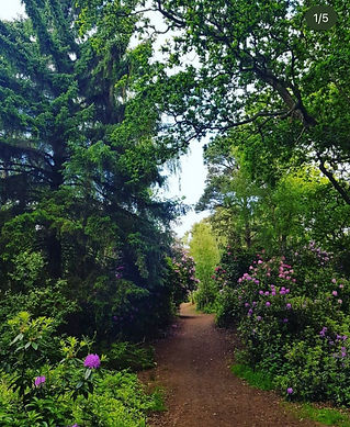
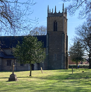
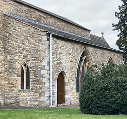
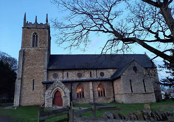
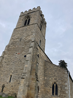
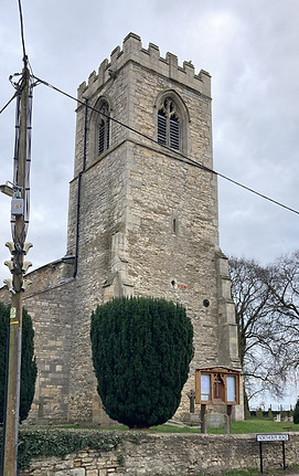
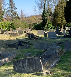
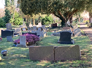
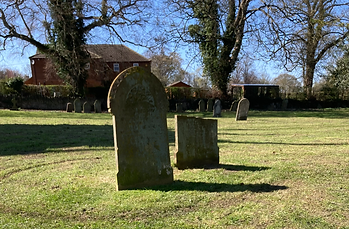
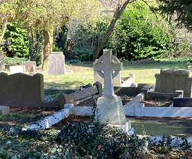
For the first part of my primary research I decided to go out and take some of my own photos to study from as I think that this is a great way to develop skills and learn how things work. I took pictures of churches, graveyards, headstones, trees, forests and water as these were all going to be featured in my animatic somewhere.
.png)

CREATING MOOD BOARDS WITH MY OWN PHOTOGRAPHY
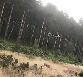


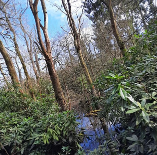

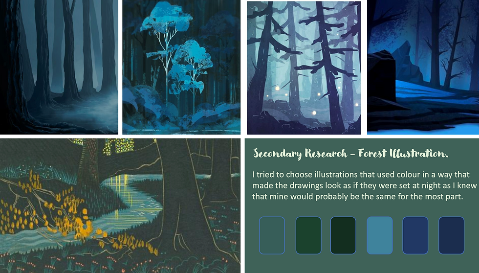
THE FOREST:
CHURCHES:


THE GRAVEYARD:


OVERALL
I feel as if taking my own photos really helped me to see things in more depth and helped me to study things easier than if I were to just look at images from the internet.
Also, actually physically going to the places and looking around helped me to get a feel of them and it overall just provided me with a lot of inspiration and gave me motivation to draw and create. I really enjoyed this part of my research and found it really useful.
CREATING MY OWN SURVEYS
Below are some examples of surveys I did to help me with gathering opinions and thoughts from an outside and audience perspective and their results. I tried many different sites and survey makers to try and see whichones worked best for me and came across many templates that worked well for me.
Overall, this method of primary research really helped me to gain more knowledge on what is important to people when it comes to this type of thing.
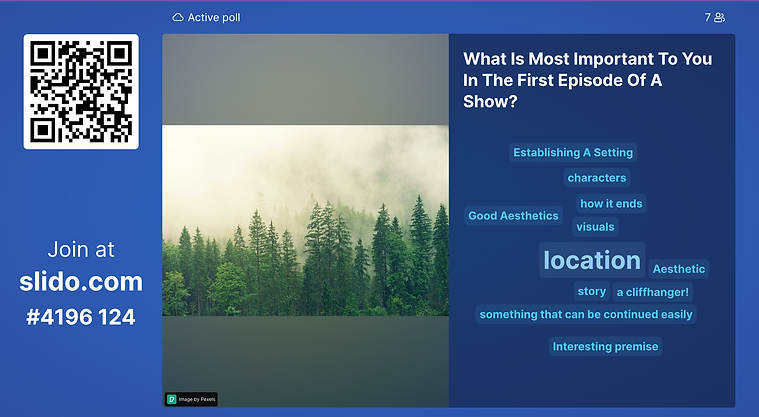


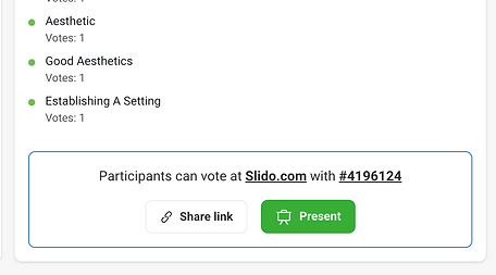
The site I used to create this survey was Slido. Overall, I really liked the way this survey came out, the way it worked really helped me to see the answers clearly and their importance to the audience.
It helped me because it operates on a voting system, as can be seen in the first screenshot, there is a collage of words and sentences - the biggest word is the one that most people voted for.
Another thing that really worked for me was the fact that the answers and the votes are anonymous, this means - for example if one of my friends or someone I know took part in the survey, I would not know and therefore wouldn’t be biased when it came to actually creating my final product.
To share this survey I posted a link to my instagram account, a place where I post most of my illustrations etc. I thought that many of my followers on there would show interest.
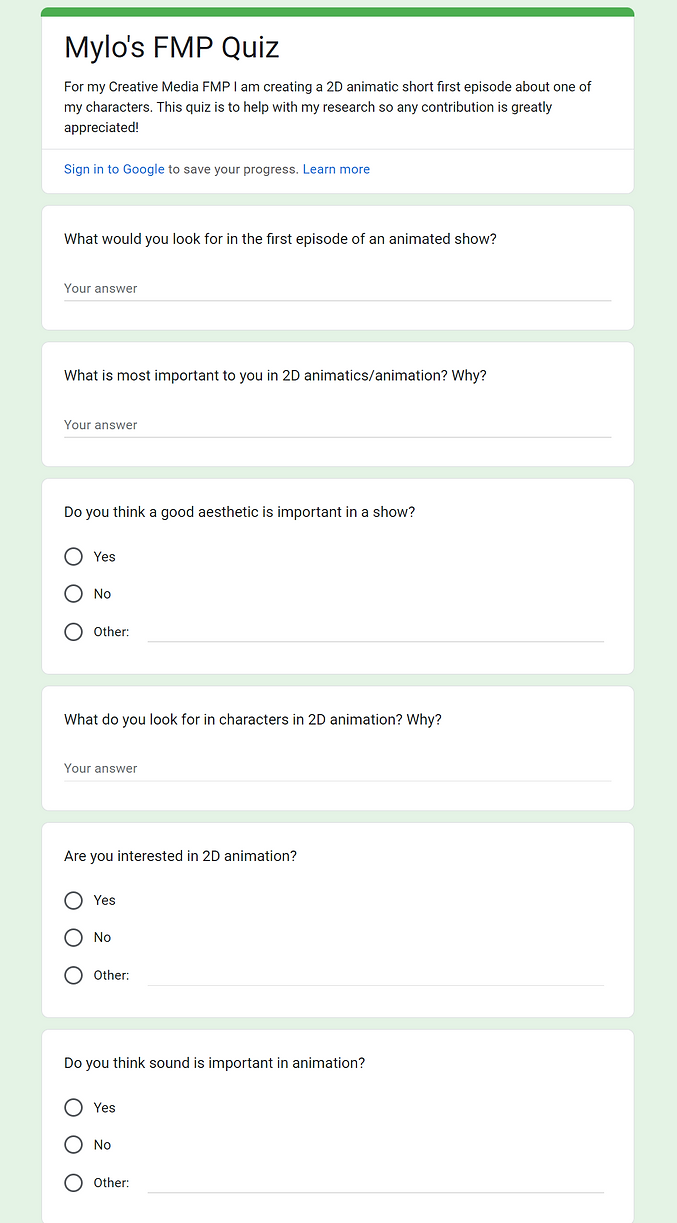
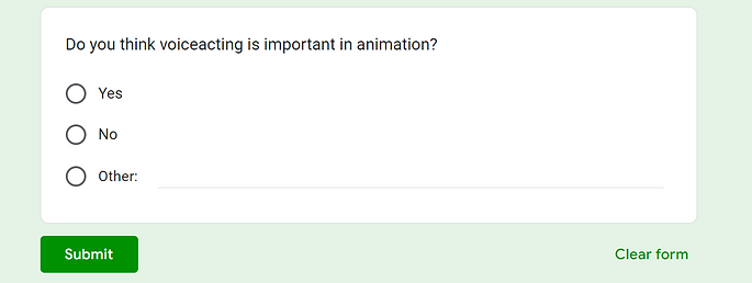
Another survey I created, can be seen in photos below, was with Google forms, this survey allowed me to include more than one question and allowed me to create questions of multiple types (eg. multiple choice/written responses) and I sent the link to many people who I thought would take part.
SLIDO SURVEY
GOOGLE FORMS
SURVEY
RESULTS


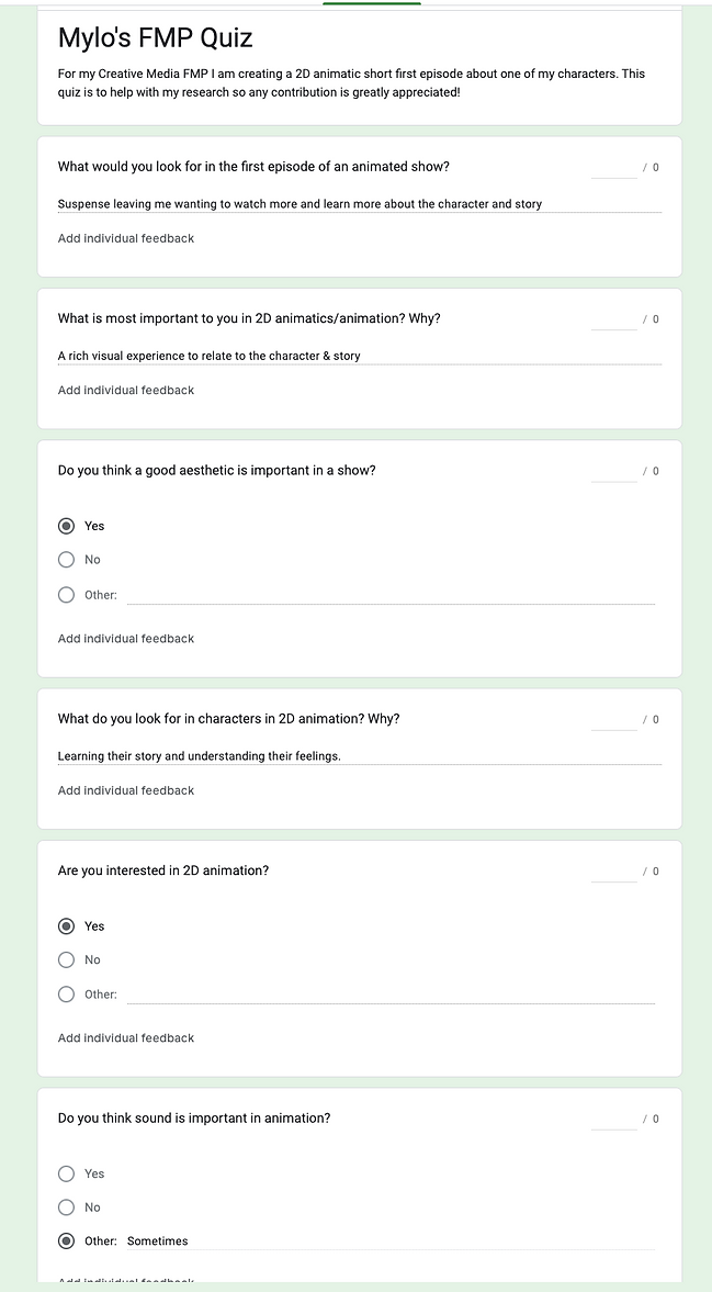
[everyone said yes to this question below]

Overall I feel that the google forms survey really allowed me to be able to see the opinions of others as I made it so that there are many options for them to type freely which ended up being really useful to me as I got some really useful answers and I think that it really helped me to think and consider what I should aim for when it comes to creating my final outcome. I think that surveys are a very useful way of gathering information as the people that take the time to partake in the survey are likely to be the kinds of people that would be interested in watching my final video so their feedback is very important to consider.