Creating a Logo.
- Mylo Sayles
- Sep 21, 2022
- 3 min read

Updated: Nov 15, 2022
(Project 1.3)

For this project, I was assigned a random animal and the task set was to create a brand and logo for it.
While doing this project I learned a number of things about branding and what makes a good logo.
As seen in this photo, my research allowed me to conclude that modern day logos have gotten more and more simplified as time has gone on.
This is because a logo is supposed to be recognisable by something as small as just a quick glance. The best and most well known logos can be recognised by just a few simple shapes. While many may argue that it's all down to how famous the logo is, It's also down to the design and how easy it is to picture in your head.
There are many principals we learnt about when being taught how to design a good logo.
These are called the GESTALT principals. They appear everywhere we look in daily life and allow our brains to process information quickly, they are in places such as logos, magazines and advertisements. This is because the Gestalt Theory is the idea that our brains will simplify and organise complicated images in order to process and understand, when looking at a logo, for example, the brain should not have to do too much work to recognise it.
Here are the GESTALT principals:
Proximity

When individual parts of a design are in close proximity to one another, the brain at a glance sees it as a whole image.
An example being the car logo on the left.
What the 'car' actually is is different to what our brain will perceive it as when first looking at it as when looking a little closer, it can be seen that the car shape is made
up of different food items. This is effective because the logo shows two things at once and very importantly, represents the company's purpose well.
Closure
As well as this, there are many logos which make use of negative space. They can do this because the brain will automatically fill in the image for us to make sense of it.
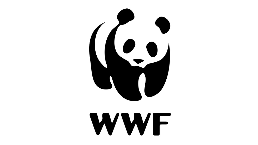
An example could be the WWF logo here, because the image is not actually showing a panda, it is just combined shapes and empty space that we automatically fill in for ourselves.
This is the type of design I eventually went with in my own project.
Similarity
The law of similarity from the GESTALT principles is that if individual elements of a logo share similar traits, the human brain will organise them into a group and see them as a whole. Similarity can be between things such as shape, size and colour.

An example of similarity used in logos could be the NBC logo.
It consists of six of the same petal type shape which the brain will group and see as a whole on its own while the empty space in the middle can be seen on its own too.
Figure Ground
The figure ground principle is similar to the closure principle in the way that it takes advantage of the way that the brain processes negative space.
The way the brain works with this principal is it will distinguish between the foreground (focal point) and background of an image. Different people will see different things first when looking at this image below.

Some may see the gorilla and the lion part first (the white elements), while others may see the tree and the birds first (the black elements).
This is effective because a logo can end up with a double meaning and therefore appear more interesting and memorable.
Continuation
The law of continuation asserts that the human eye follows lines, curves or sequences of shapes in order to determine a relationship between design elements. Continuation can carry through both positive and negative spaces in design.
The image below offers more of an explanation:


An example of continuation in logos could be this 'SPACE' logo on the right.
Our brain follows the line that appears in the negative (black) space in the lettering,
therefore creating the appearance of a
shooting star.
Symmetry & Order
Finally, another principle used in design is symmetry and order. This is because people will perceive symmetrical elements as part of a unified group due to the brain constantly looking for order in things.

Examples of logos that use this principle include:

The Olympics Logo...

Or The Mcdonald's Logo.


Comments