Task 2 - Poster Artist Research.
- Mylo Sayles
- Sep 11, 2023
- 6 min read

Updated: Sep 22, 2023
UNIT 9/10
Our Target Audience.
Using The Research.
Before going on to design our final poster we had to refer back to our audience research to come up with a conclusion around which kind of style we would be using for our illustrations.
In the questionnaire we created in the previous task, we asked these questions and got these results:


Following these results, we gathered that creating a promotional poster in the style of one of these most popular artists would be the best idea. We also had to establish what key information we would need to include on the poster so I looked at some examples online of promotional posters for events.
Some things that I would obviously have to include are:
- The name of the production.
- The time and date of the production.
- The name of the original play writer.
- The name of the department doing the performance.
- The price.
The Characteristics and Contexts of Promotional Posters - Audio Blog.
Promotional posters are a flexible marketing tool that can be used to spread knowledge, generate curiosity, and advertise products, occasions, or ideas. Depending on their goal and target audience, they can have a wide range of characteristics and contexts. The following are some key characteristics and contexts for promotional posters:
Characteristics.
Visually Appealing: Advertising posters are made to catch the eye. To draw in viewers, they frequently use eye-catching graphics, colours, and typography.
Concise Messaging: These posters typically deliver a message or call to action that is both clear and concise. The message ought to be simple to comprehend and keep in mind.
Branding: To establish and strengthen brand identity, many promotional posters include branding components like logos, slogans, and brand colours.
Images and graphics: Visual components like photographs, illustrations, and graphics are essential for getting your point across and stirring up feelings.
Contact Information: In order to encourage further participation in events or promotions, posters frequently include contact information, such as a website, phone number, or social media handles.
Date and Time: To give those interested in attending the information they need, event posters typically include the date, time, and place of the event.
Size and Format: Depending on where they will be displayed, posters come in a range of sizes, from little flyers to big billboards.
Contexts.
Film and entertainment: A classic example of a promotional poster is a movie poster. They raise interest in the movie by highlighting the cast, the title, and the release date.
Concerts and Events: Posters promoting events like conferences, festivals, and concerts can be seen everywhere. They give details about performers, schedules, and ticketing.
Posters are used by businesses to advertise their goods and services. These posters frequently draw attention to features, advantages, and exclusive deals.
Public health campaigns frequently use posters to spread the word about topics like vaccination, disease prevention, and safety precautions.
Charity and Fundraising: Non-profit organisations use posters to advertise fundraising occasions, spread the word about causes, and draw donors.
Environmental and social causes: Posters can be an effective tool for bringing attention to social justice and environmental problems etc.
The fact that posters are used to advertise and promote all things such as these and more suggests just how effective a good poster has the potential to be. I hope mine can be as effective as this.
Artist Research.
Below you will find all of the artist research I did before going on to design my poster!


Alice Oseman is a very popular illustrator and author. She is most known for the writing and
illustration of the 'Heartstopper' comics which recently have gained even more popularity than before due to the new live action Netflix adaptation. She has also written other books such as 'Solitaire' 'Loveless' and 'Radio Silence'.
She is a very well known artist within our target audience age range so it is no surprise that she came out as one of the most popular illustrators in our questionnaire. She is very popular among the queer and creative arts community so I think that she would be a great illustrator to take some inspiration from. Below are some examples of her work that particularly inspire me in the context of a potential poster.


Her work has an illustrative and detailed style and I think that it is really eye catching and nice to look at. It definitely draws the attention of the correct target audience and that is why she is so successful. Her target audience is similar to the one I am aiming for with my poster and this project which is another reason why I thought that she would be a great artist to look into.
The colours she uses within her work don't clash and work well together. She uses a lot of soft and pastel colours due to the soft and wholesome genre of her work - I am inspired by this and will definitely attempt in my work to use colour to communicate with the audience in this way. You can tell that she is a very knowledgeable and talented artist and this is why her work is so inspiring to me and many others. I definitely think at this stage of my research I will end up referring back to Oseman's work when it comes to my final poster.

Kyle Lambert.
Kyle Lambert is an LA based artist who is very well known for creating things such as the 'Stranger Things' posters.
He is very well known and has worked with some of the world's largest brands including things such as: Apple, Marvel, Netflix, Paramount Studios and more.
His art style when it comes to posters is mostly realism however it does have a more 'sketchy' look to it which I like - I feel as if this makes it his and when you see it you can instantly tell it is his work which I would love to take inspiration from - He is also very good at capturing the likeness of anyone he draws. Below are some of my favourite works of his. You can see the amount of effort put in and the detail which is a very good thing to see when looking at posters.
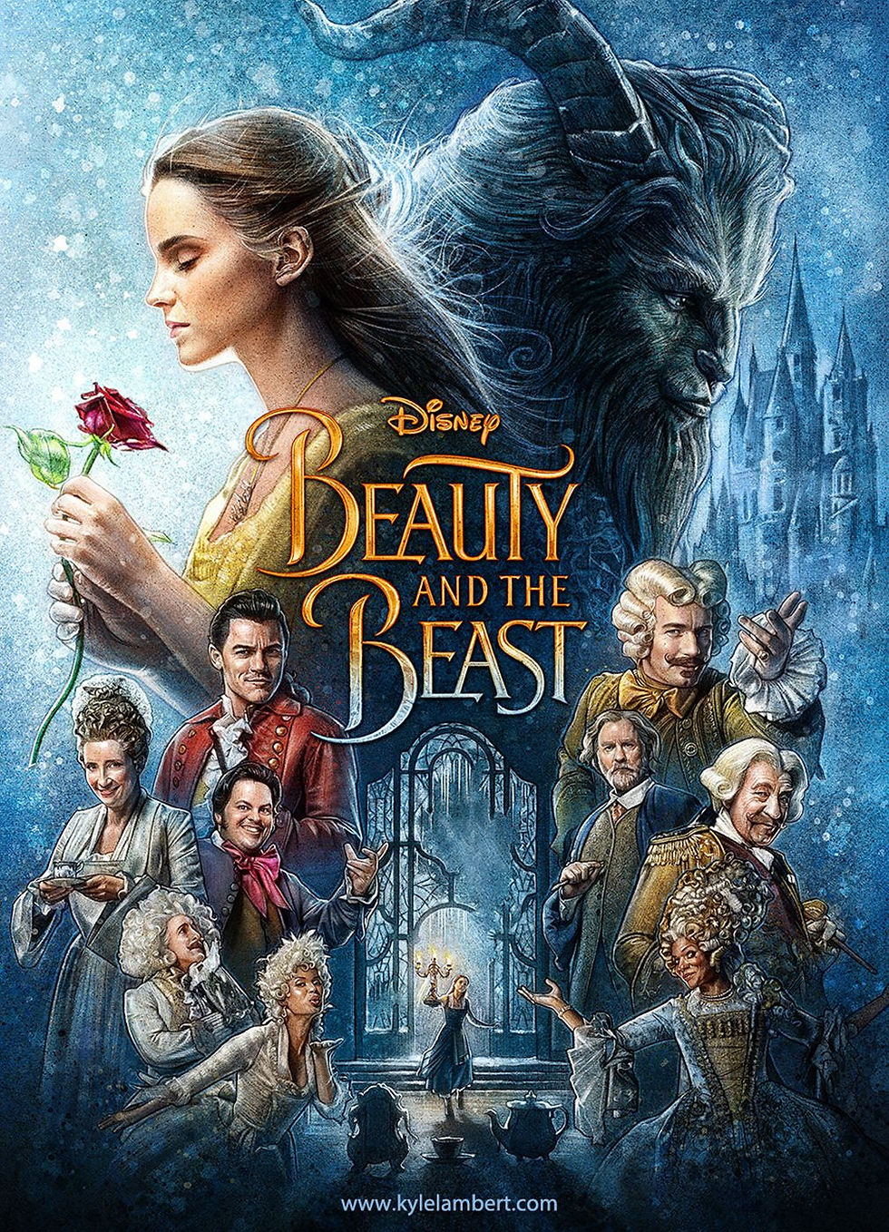

In this case however, I feel that using Lambert as inspiration could be quite a challenge because 'Our Day Out' is advertising a stage performance and in stage performances the character's appearances can change from their original description and at this stage of the project I do not know which students have been casted which roles. Another thing to add is that personally I feel that most of Lambert's work gives a kind of dramatic, intense vibe to the audience and usually features all of the characters on it which is not the kind of thing I feel that I would end up going for when designing a poster for 'Our Day Out' in particular - especially because there needs to be quite a lot of written information on the poster I will be creating and I don't want the poster to look too overcrowded or overwhelming for the audience.
Frank 'Fraver' Verlizzo.

Fraver is most known for his Broadway musical posters. He has created posters for musicals such as 'The Lion King' and more. I get the idea, from looking at a lot of his work, that the text and typography element of a poster is quite important to him - perhaps just as much as the art/illustration itself. I also noted that he tends to use quite bright, bold colours and lines which catch the eye effectively.


I feel as if this artist is very strong at choosing the correct text, colour and illustration style for the specific client and production he is designing for and this is something I would obviously like to take on board within my own work too.

Malika Favre is a French artist based in Barcelona and she is known for her very recognisable and interesting illustration style. You can tell how much she refers back to colour theory in her work which is always something to take in to account and take inspiration from. She is one of Europe's most sought after artists and there is no question why - she is extremely talented. In the past she has had clients such as: Vogue, BAFTA, The New Yorker, Penguin Books and more.
Below are some examples of her work. You can really see just how distinctive, effective and eye-catching her style is and these are all good strengths a poster should have. I may well take some inspiration from this when it comes to my final design.


Concluding this research, I felt as if I was ready to start developing the ideas for my final design. To see the page that features my idea development and my final poster click the button below which will take you to the right place!


Comments