PROMOTIONAL POSTER
RESEARCH
After completing the research on the artists, I decided that it would be a good idea to look at some already existing posters for the production 'Our Day Out' and to also look at some other film/production posters that inspire me.
Posters That Inspire Me.

These posters are inspiring to me because I feel that the colours in the background harmonise and fit together really well and the colours on the character and the text in the foreground contrast and stand out well against the background. The posters are really effective because attention is drawn to the correct areas to ensure the right parts stand out.

The typography and text also fits with the illustration and art style really well and these are all qualities that I would like to have in my final posters too.

The promotional poster to the left is effective and inspiring to me because it not only looks great design wise - with the font, illustrations and colours harmonising and looking good together - but features a key moment from the production on it that, from an audience perspective, provokes people to ask questions and to be interested as the scene on the poster is quite unusual and makes people wonder how the characters came to be in this situation and what kind of adventure they are going to have.
The poster is also effective even today when most people have already seen this film. This is such a key moment from the film that people see it and instantly recognise without reading the title where it is from. This alone makes the poster effective.
The poster also features a lot of information on it without the text and typography being too distracting from the design.
These are all ideas I would most likely want to consider when it comes to creating my own poster.
Existing 'Our Day Out' Posters.


I felt that a lot of the posters I found online were quite all 'mostly the same'.
most of them include the imagery of a bus and the students, which are a key part of the play, however I feel that I may want to challenge myself to perhaps make something completely different that also represents key parts of the play and illustrate this in a way that sparks more interest - as while a lot of the typical yellow bus imagery looks good, I feel that for our target audience at this time, an illustration of only a bus wont provoke the same amount of curiosity that some of the ideas I have in mind will.
The work above on the left is definitely my favourite existing poster I could find. It interests me a lot more than the others do and I feel that it is also the most visually exciting and appealing, it makes the audience want to understand what is going on on the bus as there seems to be a lot of chaos depicted. In addition, having seen the film adaptation of the play I feel as if the poster takes on the personality and the overall feel of the play a lot better than any of the other posters I have seen. I definitely would like to take inspiration from this and create something that provokes a similar reaction from my target audience.
IDEA DEVELOPMENT & EXPERIMENTATION
Thumbnail Sketch Ideas.
Below are the thumbnail sketches I made to quickly jot down my ideas.


For the first one, I had the idea of drawing the girl on the cliff with the teacher trying to stop her from jumping. This is a key moment and theme in the play as it really emphasises the struggles that these children go through within their day to day lives and how these struggles make them suffer mentally. This part of the play, in my opinion, was the most eye opening and catches the most attention. I feel as if I put this on a poster it would really get people curious and make people want to go and see the play.
I am now thinking though, if I were to go ahead with this idea I may only include the girl on the cliff to create more mystery on if someone ends up coming to save her in the play, I do not want to spoil what happens to any of the characters.
In the second thumbnail, I drew one of the children with a chicken as a reference to the zoo scene. I felt as this was quite out of the box and would probably spark interest and questions from anyone that were to see it on a poster.
The middle thumbnail features a camera and some film winding across the page. There is also a map with an X on it to hint towards the adventure and the trip. The film and the camera are a reference to the play as the film camera is a constant throughout the play as the characters use it to document their journey so I thought it could be a nice touch.
The next one features a can of lemonade and some sweet and chocolate wrappers as a reference to the scene on the bus where the teacher talks about how deprived the children are to the bus driver. She talks about how the children have probably never had sweets or lemonade and the driver gives them money to go and buy themselves some drinks and sweets.
Finally, I created a thumbnail of the children on the bus however they are throwing up 'rude' gestures at the back window. I was mostly inspired by the example poster above on the left with the children causing chaos on the bus.
Sketches.
The idea of the girl on the cliff was the first idea I started to develop more on as I really felt that this sparked a lot of interest from people when I explained and showed my ideas to them. As I said before, I feel as if a poster like this could create a sense of mystery and intrigue people.
For my posters I have decided to go down the more 'Alice Oseman' style route as I think that this fits with the emotional, sometimes dark yet childlike theme that the production 'Our Day Out' has and from the survey we created she was one of the two most popular illustrators and she fits the most out of those two.
In my opinion, I feel as if so far I have done a decent job at creating a similar likeness to Oseman's art style and I think that I have left a good amount of space on the page for the text and info I will need to include on the poster. I do however feel that my drawing at this stage needs some more emotion to it as this is an emotional part of the play. I feel like adding more texture and possibly darkening the colours a bit could help this along really well. So far, for this illustration I have used Procreate to sketch and block down some colour ideas but I plan to take it into Adobe illustrator to experiment with text/typography and maybe some background ideas. I definitely want to finalise and take this idea further.
Another Idea I decided to sketch out was the camera and the film idea as I thought this was a relatively 'out of the box' idea I hadn't heard of anyone else considering. I don't think it creates as much emotion or intrigue as the cliff idea however I really like the composition of all of the elements and how they are arranged on the page.
I thought that if I developed on this more with colours and did something interesting with the typography this poster could be really effective.
This idea with the lemonade can and the sweets was interesting to me however I found that this was less out of the box as people had similar ideas to add these elements to their poster, while this doesn't necessarily mean that I can't use this idea as mine is still very different and stylised in my own way. I might still try to build on this concept more though.
Developing Designs.
As can be seen in some of the videos above, I started just blocking down some relatively simple colours just to get my ideas and thoughts down and to test things out. After this, I went on to develop more in the designs and on things such as the colour grading and texture. I created some of the texture by sketching in Procreate however eventually took my illustrations and sketches into Adobe Illustrator to develop them even more. The idea I developed the most was definitely the idea of the character on the cliff edge as upon referring back to all of the research this felt like the best fit.
Some examples I have included below will show you why I think this.


Because Alice Oseman came out to be one of the most popular illustrators and drama came out to be the most popular genre that also fit in to the genre of the play, it felt appropriate to create a poster that captures both a dramatic emotion and the art style of Alice Oseman. The idea and sketch of the girl on the cliff, in my opinion, seemed to have a lot of potential in both of these areas.
That is why below, I developed and worked at the idea even more.
Colour Grading.

.png)
When I originally blocked in the colours and did a bit of shading (left) I felt that it was missing some emotion. I did some colour grading and lowered the saturation to convey more of the girls emotion.
This ended up being effective however I still felt that the illustration was missing a lot from it. I thought that it felt a bit flat and the texture of the water and the character compared with the cliffs, rocks and background in my opinion kind of looked a little bit like I had combined two styles together or like it was unfinished.
Texture.
After the realisation that more texture needed to be added, I decided to look for some inspiration in other artists. A great illustrator I ended up finding was Angela Harding, below I have included some examples of her work.


I really enjoy the way she uses linework and shape to convey a certain emotion and style. My plan at this point was to combine both Oseman's cheery, cartoony style with Harding's more sharp and rough style. You can see the development and result of this below.


As can be seen above, I experimented with the way the water looked as I wanted it to look more emotional and dark to fit with the mood of the scene. As you can hopefully see this added so much more to the mood as I hoped it would and I feel that it gave the illustration so much more style and personality, much like Oseman's work. It also added contrast to the piece and fit together with the white elements within the characters uniform.
Something I didn't really like though is that even though the illustration is supposed to be darker than it was before and more murky, I didn’t really like how murky the background was and I didn’t really like the gradient I put there either. I feel that with the background the illustration looks good as an illustration alone but not as an illustrative poster as I know I will eventually have to start working with text and typography and I feel like this will be hard to do in a way that will create an effective poster that stands out from a distance. My aim was to begin with that the poster looks good from both far away and close up and I felt that this just wouldn’t give me what I wanted from my final design.
Background.

Typography.
I tried drawing some cliffs in the background in illustrator to give the illustration more depth and creating a mask on them to add texture but I wasn't really sure how to work with the result of that after doing it when it came to me adding my typography. It was also still very murky at this point and I was worried that the poster wouldn’t stand out enough when it was done.
Something I found that I really did like was the final font that I experimented with in the video above. I was disappointed to find however that there were later some technical difficulties with the compatibility of the font and the illustrator software and I couldn’t find a way to solve the issue. Therefore, I ended up continuing to experiment with other type.
Final Edits & Decisions
Above are three screen recorded videos of the final edits I did that made my poster variations complete. After finding a suitable font and testing it out in illustrator, I took my poster back into procreate to experiment and rearrange different elements and to do some further colour grading. You can see my thought and design processes in the videos and below I talk in depth about what I liked about my final poster and what I felt I could've improved on and done better.
FINAL OUTCOME & EVALUATION
.png)
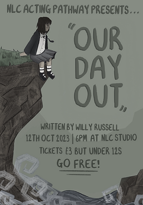.png)
.png)
These were the final designs I came up with and eventually sent through to the client in the end. I decided to give them a few slightly different edits so they had multiple options and could choose which one they liked best.
Overall I feel that, for the most part, I was able to capture and execute things in a way that I wanted to when it came to my poster. I think that first of all, something I think I have done pretty well is capturing Alice Oseman's art style. As someone who is a big fan of her work, I was very excited to be able to create something inspired by her as in the past I have studied and looked quite deeply into her work. I feel as if this knowledge shows through in my illustration.
Another positive about my design, I think, is that I feel that my choice of font fits in really well with the style of the illustration on the poster and also gives a similar handwritten vibe that Alice Oseman features within her typography. I also feel that the typography positioning is quite strong as I have made the title obviously the biggest thing on there however as you can see underneath that the other information is displayed - I feel that it is displayed at an appropriate, legible size and I feel that it was quite an effective choice, from a marketing standpoint, to underline and make the 'go free' text a bit bigger as this will draw people in more.
I feel that my poster is quite eye catching and draws attention to the right places effectively with both illustration and text. I made it so that the brightest element on the page is the character's shirt, therefore this is where the eye is automatically drawn and as I said above, the positioning and text sizing makes sense from both a style and marketing standpoint. I also think the choice to give the background a more solid colour appearance does the illustration some good as it pushes the more detailed and important parts forward instead of it all blending together and becoming too messy.
I also think that as a whole, because of the scenario I have depicted, my poster creates great curiosity and mystery which therefore helps it catch and hold attention. It allows a potential audience to ask questions and then in turn want to see the play. I think another reason my poster catches attention, other than the scenario depicted itself, is the way texture, shape and colour captures the sort of melancholy and emotional mood of the situation and mental anguish that the characters go through in the play.
On the other hand, I feel as if I'd have liked to have spent much more time focusing on the typography and then possibly done something more imaginative and interesting with the text. I would have also loved if I'd had the time to focus on some other ideas as I felt that a lot of my other small sketches had quite a bit of potential.
Generally though, I feel that this part of my project has been extremely successful. I got some feedback from others too both at the end and throughout my creation process which was extremely encouraging and made me realise which things about my design were strong and which parts maybe needed a little bit of work.
The feedback I got also helped me to try new techniques in different softwares such as adding masks in Adobe Illustrator for texture or colour grading in Adobe Lightroom.
In the end, I am really proud of my efforts especially as the acting department (our clients) ended up coming to me personally and saying that my work was a favourite among their group and deciding to print and display my poster around campus for all to see.
FEEDBACK
Below I have featured feedback from the client, a professional graphic designer, other media students and the drama students who acted in the play we were promoting.
Press the button below!